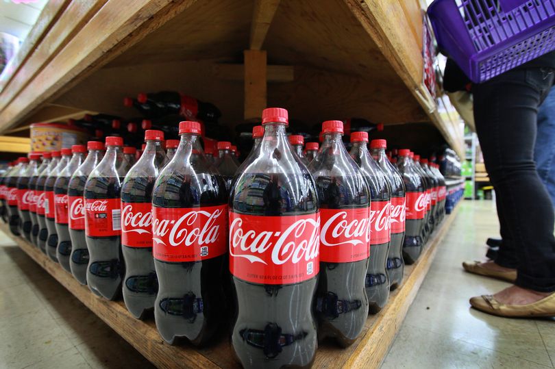

Coca Cola, one of the world’s most renowned brands, is instantly recognisable by its signature red packaging and swirling white script.
Over time, as the company introduced new iterations of its classic drink – from Diet Coke and Coke Zero to limited editions and novel flavours – the celebrated logo has been adapted for each variant, yet Coca Cola retains its unique flair.
Brands worldwide aim for a similar level of recognition, with much of this success attributed to the impact and recognisability of a company’s logo. “Businesses cannot overlook the value a great logo holds; they are the connection between a company and potential customers, and what customers will remember most,” comments Richard Lau, president of LOGO.com, a leading figure in logo creation and marketing strategy.
While the Coca Cola logo might appear to be just a stylised rendition of the company name, the elongated tail of the ‘C’ is believed to symbolise a smile, reflecting the brand’s focus on happiness and joy. Richard elaborated: “This subtle message may go unnoticed, but it subconsciously creates a positive association with the brand in the minds of consumers.”
Coca Cola openly shares its origin story, including the genesis of the logo, providing insights into its evolution over the years on the official website. The famous beverage’s recipe was perfected by Dr John S Pemberton in May 1886, who was a pharmacist based in Atlanta, Georgia, and created the beloved syrup for the drink.
Coca Cola came to be when carbonated water was combined with the specially crafted syrup, and went on to be described as “delicious and refreshing”. The Coca Cola website recounts that Dr Pemberton “carried a jug of the new product down the street to Jacobs’ Pharmacy in Atlanta, where it was sampled, pronounced ‘excellent’ and went on sale as a soda fountain drink for five cents a glass”.
It was Frank M Robinson, Dr Pemberton’s bookkeeper, who proposed the company name “Coca Cola” and “penned the flowing script that is famous today”. Robinson’s inspiration for the iconic brand name came from his belief that “the two Cs would look well in advertising”, a concept which proved similarly successful for Coco Chanel when she launched her legendary, eponymous fashion house in 1910
Robinson also experimented with several versions of the company’s logo in Spencerian script, a popular style of writing at the time. There were multiple editions of logo designs and shapes until the late 1960s.
In 1969, the Arden Square logo was introduced – “presented in a red box, with [Robinson’s] Coca Cola script underlined with a white ‘wave’, or ‘Dynamic Ribbon Device’.” This is the emblem still in known and used across the globe today.
Since the revelation, people have been discussing it on Reddit. Just recently, someone gushed over Coca Cola’s timeless design. One other person pointed out: “Also cool to see how it translates across different languages
Another added: “Ever since someone told me about the faces in the logo I can’t unsee it whenever I look at it.” Then a third gushed: “Perfect logo.” And a fourth chimed in: “Coca Cola is a cool logo that’s why they didn’t change it.”